
Coleridge read the work of Philadelphia naturalist William Bartram in the 1790s, noting, “The latest book of travels I know, written in the spirit of the old travelers, is Bartram's account of his tour in the Floridas. It is a work of high merit every way.” Specimens of the Table Talk of Samuel Taylor Coleridge London John Murray 1827, 61. https://archive.org/details/specimensoftable01coleuoft/page/60
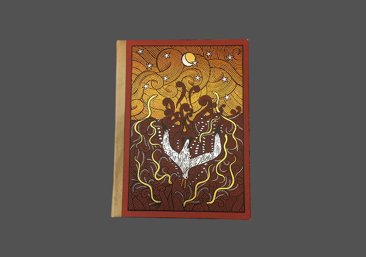
The vibrant and exotic illustrations featured in this edition evoke Bartam’s descriptions of the natural world in his travel literature:
“We presently took some fish, one kind of which is very beautiful; they call it the red-belly. It is as large as a man's hand, nearly oval and thin, being compressed on each side; the tail is beautifully formed; the top of the head and back, of an olive green, besprinkled with russet specks; the sides of a sea grean, inclining to azure, insensibly blended with the olive above, and beneath lightens to a silvery white, or pearl colour, elegantly powdered with specks of the finest green, russet and gold; the belly is of a bright scarlet red, or vermilion, darting up rays or fiery streaks into the pearl on each side; the ultimate angle of the branchiostega extends backwards with a long spatula, ending with a round, or oval particoloured spot, representing the eye in the long feathers of a peacock's train, verged round with a thin flame-coloured membrane, and appears like a brilliant ruby fixed on the side of the fish; the eyes are large, encircled with fiery iris” (Bartam’s Travels 12).
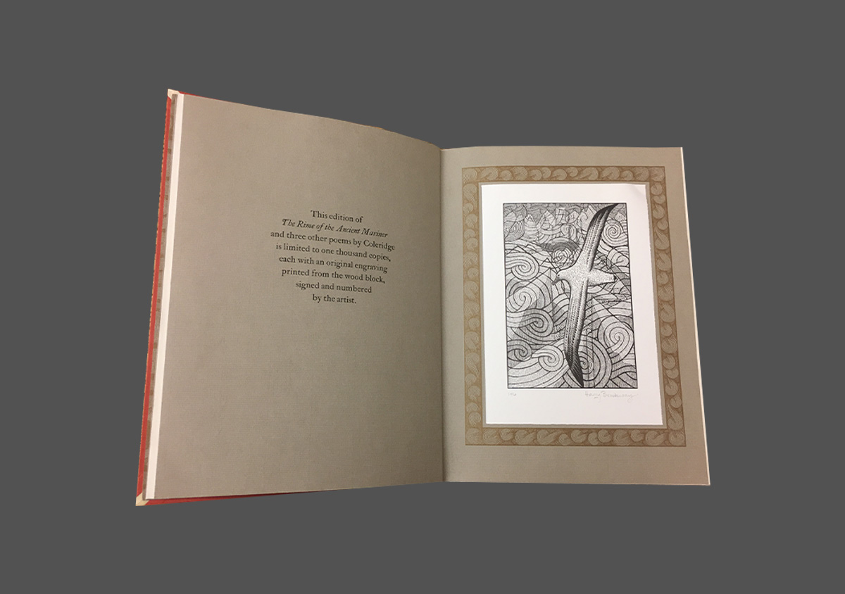
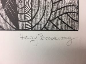
In addition to many digitally reproduced illustrations, this edition features an original print of a woodblock engraving signed by wood engraver, Harry Brockway. The print is signed and numbered by Brockway. This edition is #146 of the 1000 produced.
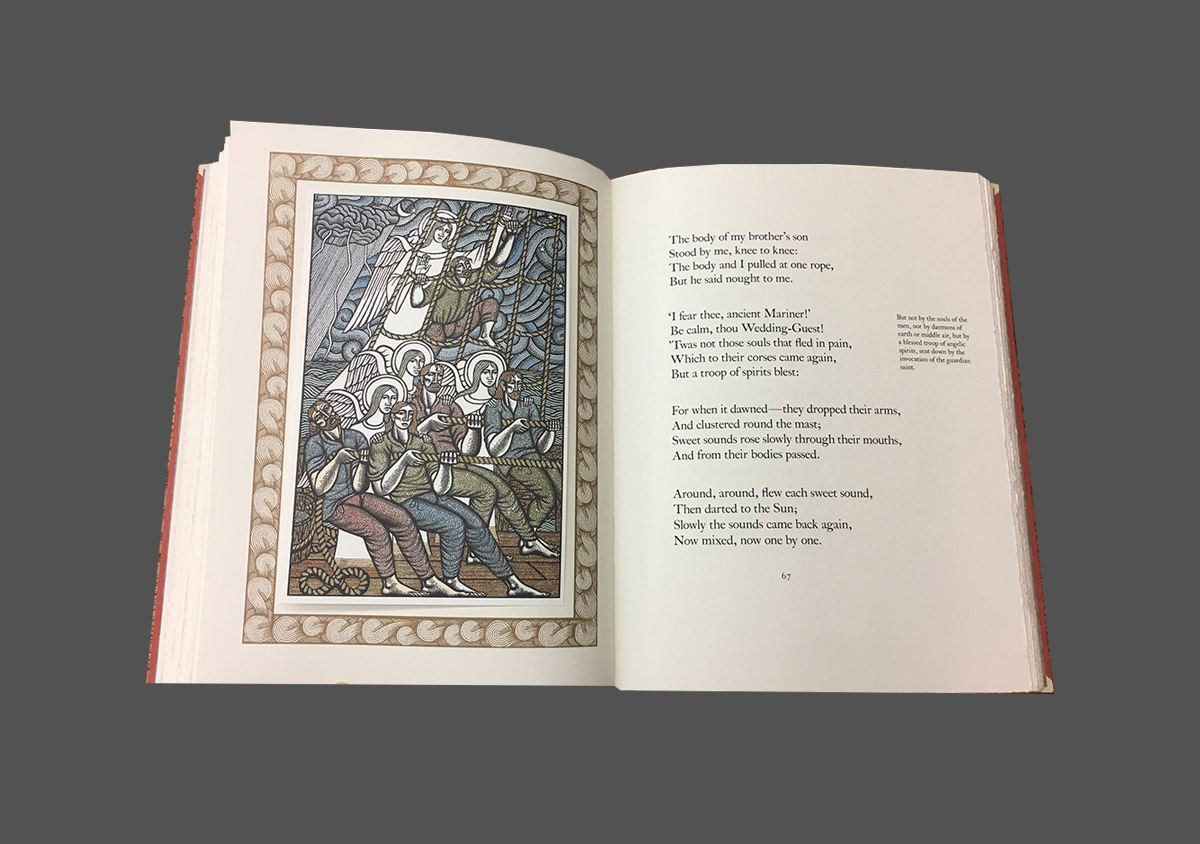
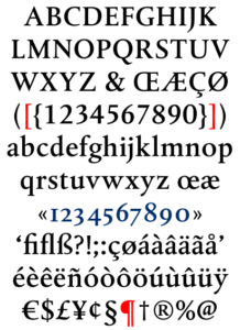
This edition of Coleridge’s poem is set in Albertina, a typeface created by the Dutch graphic designer and typographer, Chris Brand in the 1960s. It’s clean, highly legible serif letterforms give Albertina a strong presence on the printed page.