
Short Biography and Context
Throughout the sixteenth and seventeenth centuries, printing in England was conducted largely in three centres: London, Oxford and Cambridge. One rare exception comes at Eton, where in 1610, a press was set up by the London stationer, Melchisidec Bradwood. Over the next three years, a small selection of works would appear from the Eton press and they were published by the King’s Printer, John Norton. At the centre of the Eton publications was Henry Savile, an established scholar of mathematics who also translated works by Tacitus and a series of English medieval Latin chronicles in the 1590s.[1] Savile would continue his editorial work at Eton, and most remarkably, with an ambitious eight volume edition of the writings of Chrysostom (c. 347-407), an early Church Father who served as Archbishop of Constantinople. In order to produce this work, Savile had communicated with continental scholars in Europe, often comparing manuscripts in order to reach the ideal, authoritative translation. He also looked to a number of English classical scholars for advice and for notes for the edition. The end result was a remarkably produced book that also came with remarkable costs. A late seventeenth-century source notes that the total expenses for the 1000 copies printed in 1613 was some 8000 pounds, a massive sum for the time. Expensive as it was, more troubling is that Savile had difficulty selling copies right up to his death in 1622. Nevertheless, the end result was a beautiful example in the history of the book.[2]

[1] His Oxford edition of select works by Tacitus first appeared in print in 1591 (STC 23642), while the London collection of Chronicles titled Rerum Anglicarum Scriptores post bedam followed in print in 1596 (STC 21783). For a discussion of Robert Sidney’s copy of Rerum Anglicarum Scriptores post bedam, see Elisa Tersigni’s post for the Centre for Reformation and Renaissance Studies’ Featured Book blog. https://crrs.ca/featured-book/frb5/ |Back to section
[2] The preceding short biographical sketch and details on the edition of Chrysostom are indebted to R.D. Goulding, “Savile, Sir. Henry (1549-1622)” Oxford Dictionary of National Biography, 08 January 2015
https://doi.org/10.1093/ref:odnb/24737. Goulding notes that the appearance of a continental edition with added Latin translations by Fronton du Duc in 1614, along with other translations in the immediate years following, is likely why Savile’s edition failed to sell. |Back to section
Printing and Typography
Making Savile’s edition of Chrysostomi Opera Graece required ample time and resources. The high-quality paper used to produce the several thousand printed folio leaves would have been significant and so too would the new Greek type.[3] Since these key supplies were typically imported from places such as France and Germany, the costs would have been significant. Add to this the many workers who would arrange, compose and ultimately print the folio sheets and we start to get some sense of the labour required to produce this book.
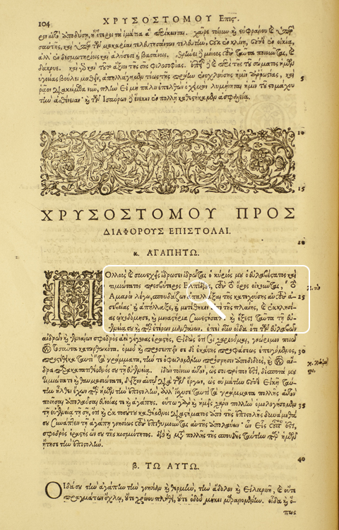
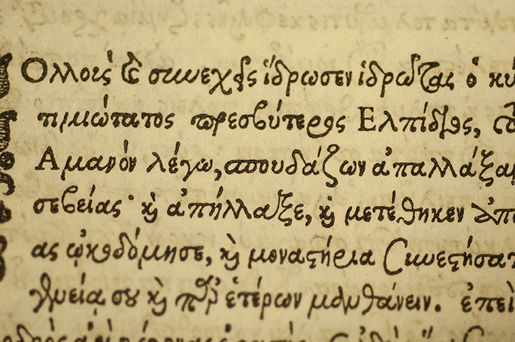
One of the most striking features of this edition is the Greek type. As we look down at a page of text, say this one (left), we can easily forget that we are looking at an inked impression and that the individual type, or sorts, needed to make that impression were themselves first cut from metal. The type designers and punchcutters who cast the letters are key intermediaries in the artistry of the early printed page. For the vast majority of the eight volumes, one encounters lines upon lines of this impressively printed Greek font. Looking closely at a section allows us to see how it was composed. While most of the Greek shown here required the compositor to arrange a line of text one letter at a time, he would have to move between upper and lower cases, accented letters, and ligatures, i.e. a type specimen containing two or more letters. The close-up shown here illustrates my point (left, magnifying glass icon). New sections would often begin with ornate initials, which were cut from wood (below, Image 1, Image 2). Similar woodcut ornaments and devices might also be used, as in the individual titlepages for each of this edition’s volumes. The choice to print the royal arms (below, Image 3) makes sense when we consider that John Norton was King’s Printer, or as the titlepage notes, Regius Typographus (below, Image 4). These titlepages also provide a clue to the time required to produce this work as the volumes’ imprints range in date from 1611 to 1612.

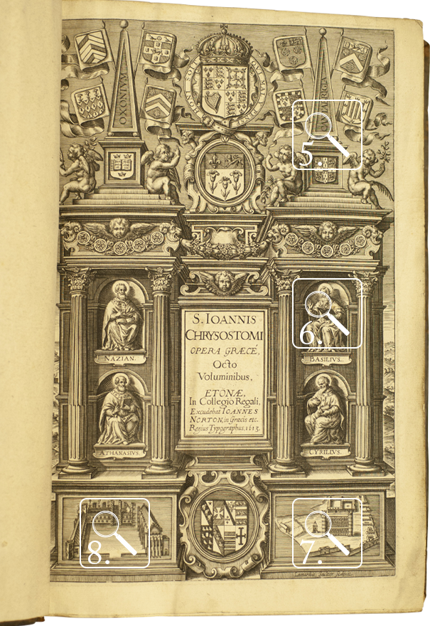
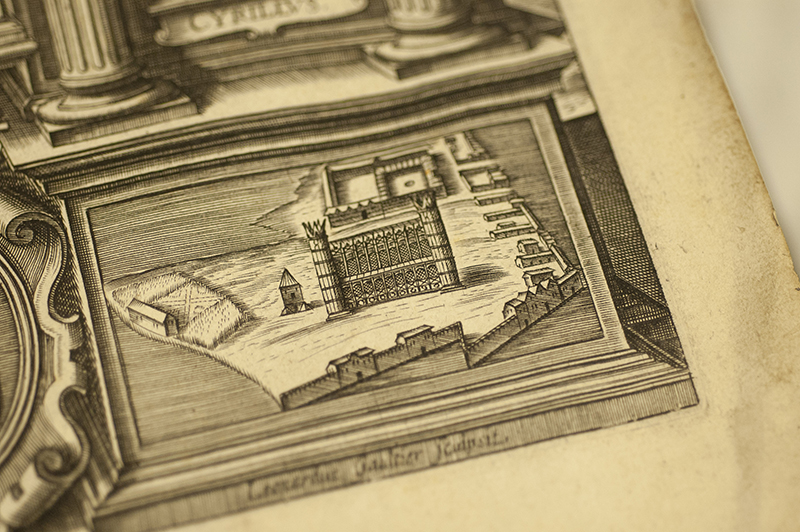
In addition to the extensive labour needed for the letterpress, Savile or Norton arranged for a special opening titlepage to be produced, known as a frontispiece (see below). Unlike the rest of the volume, this single page impression was engraved, likely on a copperplate. To produce this image in c.1612-1613, one would need a separate device known as a roller press. One would also need a talented artist who could carve the detailed impression into the copper. In this particular case, the artist was Léonard Gaultier, a French engraver who worked primarily on continental imprints. As was common with such engravings, Gaultier included his Latinized signature near the bottom of the impression (right).

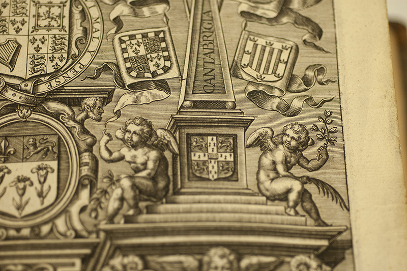
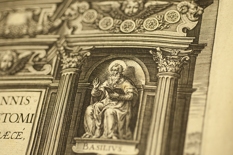
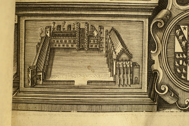
The decision to include the frontispiece likely came late in the production as certain copies of Chrysostomi Opera Graece survive without it.[4] More than an image, the frontispiece offers a kind of argument. Starting at the top of the page, we see images of national and academic authority. The royal arms with motto and crown sit at the centre top with cherubs pointing upward. While those gestures may be to the unrepresented Divine, they may also be pointing to England's King, James I, as a divinely appointed monarch. The two obelisks recognize the importance of Oxford and Cambridge, the key centres of learning in England (below, #5). Their presence may also derive from the fact that Savile looked to scholars from both universities for assistance with the translation and notes. At the centre of the page are four Church fathers, each seated in a cartouche with book in hand (below, #6). Their presence is a reminder of the larger patristic tradition of which Chrysostom is part. Finally, at the bottom of the page are pictures of Eton’s buildings and courtyard, the place in which the book was produced (below, #7 & #8). Taken as the whole, the image serves as an acknowledgement of various influences at work in the production of this edition. That this comes as the first page in the eight-volume edition is also a statement of the book’s importance.
[3] Ian Gadd notes that Norton was involved in the project from as early as 1601, “seeking out on Savile's behalf both an appropriate font of Greek typeface and a suitably skilled printer.” See “Norton, John (1556/7-1612)” Oxford Dictionary of National Biography, 03 January 2008. https://doi.org/10.1093/ref:odnb/20347 |Back to section
[4] Huron’s copy, Call: BR65.C5A2 Vol. 1-8 Rare Books, is of STC 14629a. For a full collation and other details, see http://estc.bl.uk/S112373. According to the STC, this is a reissue of STC14629/14629.5. The earlier edition does not have the engraved frontispiece and has some volumes with title pages dated 1610. |Back to section
Ownership and Binding
Huron’s copy of Savile’s edition of Chrysostomi Opera Graece (Eton, 1610–13) came as a gift in 1969 (right, #9). While the Library bookplate does not identify who made the donation, it is likely that the set came from John Y. Mackinnon, whose stamped signature appears in this and other Huron rare books on the front endpapers (right, #10). While there is no other evidence of previous ownership, the copy is in its original binding. All eight of Huron’s large folio volumes are bound in typical, early seventeenth-century blind-tooled calf with roughly cut turn-ins over pasteboards (right, #11). Supports can still be seen laced into each of the boards and most of the volumes contain examples of printer’s waste (for more, see below). The spine of each of the large folio volumes is made of six compartments separated by five raised bands (right, #12). Compartment 2 in all of the volumes contains the same label with an abbreviated title of the work in gilt, while Compartment 5 denotes the biblical texts covered in each volume. Volume 2, for example, has the words “MATH: JOHAN” to show that it contains Chrysostom’s commentaries on the Gospels of Matthew through John (below, #13), while Volume 3 has the words ROM: EPHES to show it covers the same for the Books of Romans to Ephesians (right, #12) . In the remaining spine compartments of each volume, we see more gilt ornamentation, including flowers and hatchings on similar brown labels.[5] Finally, at both the top and bottom of the spine of each volume are the head and tailbands in a mix of blue and beige threads.


While much of the sewing structure is hidden from view, there are instances when wearing to the spine allows us to see more of the book’s internal structure. Volume 5, for example, allows us to see four places where the blue threads from the lower endband are sewn upwards into the spine and ultimately to bind the textblock (below, #14). In Volume 2, wearing between compartments 1 and 2 allows us to see the raised bands are comprised of a double set of sewing supports (below, #15). For scholars of bookbinding, the details of a binding’s decoration and structure offer clues to how the book was bound, the expertise required to produce such a structure, and the possible costs involved.


[5] The abbreviated titles and other labels found on the spines of each of the eight volumes were likely added at a later period, possibly in the 18th-century. |Back to section
Forensics: Printer’s Waste
One of the most exciting features of Huron’s copy is that each of the volumes contains uncut printed sheets which are sewn into the binding at front and back for added support. The technical term for this feature is waste. In the earliest centuries of print, binders often turned to older medieval manuscripts, which they might cut up to use as waste to reinforce the binding in the form of small strips for the sewing supports, as liner for the spine, or in large leaf-sized sections to protect the textblock. A good example can be seen in a recently discussed 1534 edition of Sophocles at Stanford. In that copy, a parchment leaf from a fifteenth-century manuscript of Horace has been used as waste at the front of the copy.[6] One of the appeals of earlier manuscripts is that they were often made of parchment and so provided a strong material to connect to the textblock. While this practice of using manuscript waste would continue into the seventeenth century, it became less common. Instead, bookbinders often turned to discarded printed sheets, or printer’s waste, for the same purpose. They might also use leaves from a printed book which they would then recycle, in a similar way, as printed waste.
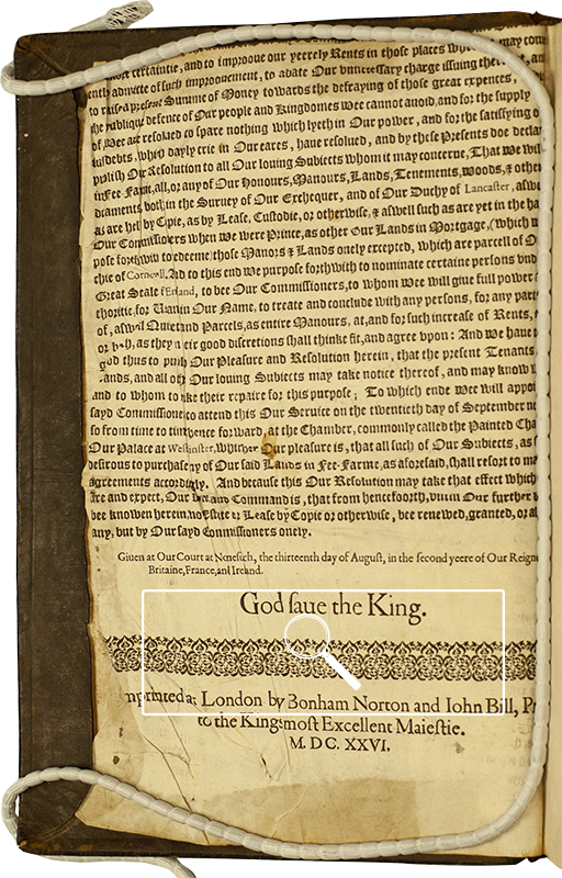
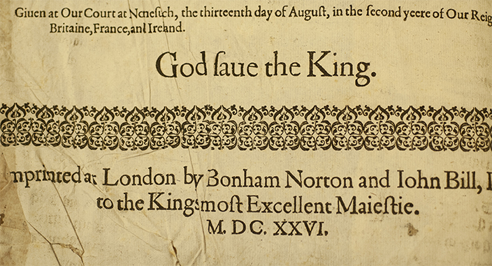
All eight volumes of Huron’s copy of Chrysostomi Opera Graece (Eton, 1610–13) contain examples of printer’s waste deriving from a variety of English and continental imprints. Several volumes contain large folio leaves as waste as seen in volumes 1, 2, 5 and 7. Volumes 1 and 2 contain waste deriving from an edition of Jerome’s Commentaries and Volume 5 contains leaves from the index of an edition of the Summa Theologiae of Thomas Aquinas. Volume 7 contains one of the most interesting pieces of printer’s waste. Found at the front of the copy is a portion of an English proclamation (left). After some searching, I was able to identify it as the bottom section of the second sheet of A proclamation to declare and publish His Maiesties resolution, to ascertaine his reuenue, by granting his lands holden aswell by copie, as otherwise in fee-farme. The proclamation, as the waste shows, was printed by Bonham Norton and John Bill in London in 1626.[7] As King’s printers, they would be responsible for printing all official documents for Charles I. Proclamations typically survive in small numbers, in part, because as single sheets they were usually not bound. They were also produced for a specific moment, and so, much like newspapers, were often discarded when no longer of use. According to the ESTC there are nine known copies of this proclamation. We might add another, or at least a part of another, to the list (left, magnifying glass). As a final point, this piece of waste is also important for it helps us to date the binding. We can now conclude that Huron’s copy of Chrysostomi Opera Graece (Eton, 1610–13) was bound sometime in or after 1626.
At the back of the same volume 7 is more English printer’s waste. This uncut sheet, however, contains parts of the Apocrypha from a small edition of the King James Bible. Similar uncut sheets of Apocrypha are also found in Volumes 4 through 6. While on the one hand, this bible waste couldn’t be more different from the single sheet proclamation, as it is from one of the most popular books printed in the period, on the other hand, because of its size and fragility, it too survives in similarly small numbers.
One of the most valuable aspects of this Bible printer’s waste is that it allows us to see how books were produced in letterpress during the printing process. As Sarah Werner[8] and others remind us, handpress books were printed as sheets, which were then folded, cut and sewn, before possibly being bound. In the example, shown here, from Volume 4, we can see the eight pages that make up the one side of the forme (below, #16). The pages are not always sequential, as can be seen by the shifts in chapter numbers and running titles across the sheet. This makes sense when we remember that these sheets still need to be folded and cut. At first glance, I thought I was dealing with an octavo. The eight pages suggested as much. However, a second uncut sheet in volume 6 showed me that this was a duodecimo (below, #17). Although one can’t see the full sheet here, as it has been cut, it would have contained 12 pages per side.
After much searching, I was able to identify this waste as deriving from an extremely rare duodecimo Bible printed in 1625 (see EEBO image 390 for comparison, below). Similar to the proclamation, this was also printed by Bonham Norton and John Bill. Examples of the sheets, all deriving from the apocrypha, can be found in Volumes 4 through 8.[9]


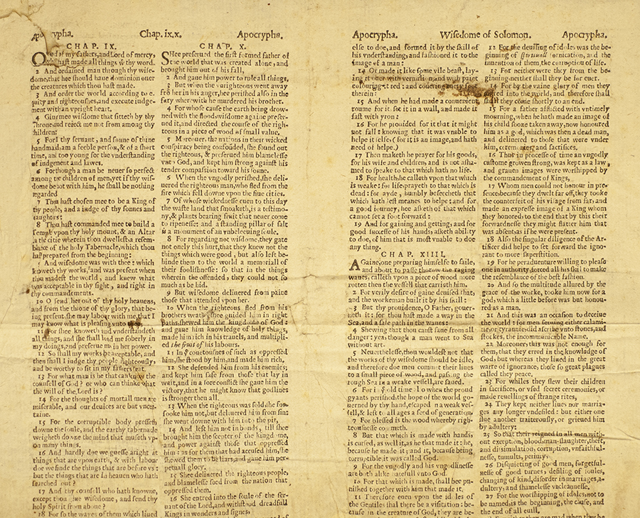
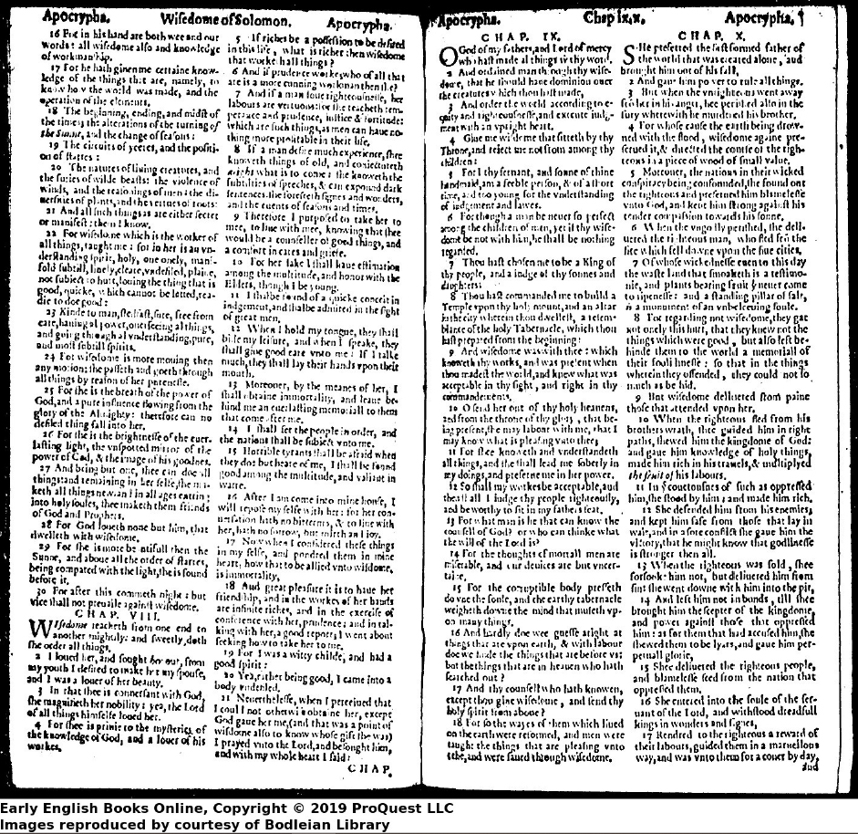
Image retreived from: http://search.proquest.com/books/holy-bible-conteining-old-testament-new-newly/docview/2240935102/se-2?accountid=15115
While such sheets are of value for illustrating this historical process, they are also important as models for those who continue to print by hand. At Huron, we have just started a letterpress studio and now have a larger press capable of producing different formats. Examples of waste such as those just discussed provide great examples for teaching the various formats and the differences between sheets, leaves and pages. The three examples shown here illustrate examples of folio (#18), quarto (#19) and ducodecimo (#20) waste.

[6] See Elizabeth Ryan’s “Hidden Treasures” in the Stanford Library Blog. https://library.stanford.edu/blogs/stanford-libraries-blog/2020/04/hidden-treasures-encounters-binders-waste-stanford-libraries |Back to section
[7] STC 8837. |Back to section
[8] Studying Early Printed Books, 1450-1800: A Practical Guide, Wiley-Blackwell, 2019. |Back to section
[9] The ESTC lists similar duodecimo editions dated 1623-1627 that are not available on EEBO. It is possible that the sheets used as waste derive from one of these editions. However, the examples I’ve found match STC 2273.5 and so, for now, I’m assuming they are from this edition. According to the ESTC, the only complete copies of this 1625 edition are held at the Bodleian Library, Oxford and the Lutheran Theological Seminary in Philadelphia. The printer’s waste in Huron’s copy includes sections from several books of the Apocrypha, including 1 and 2 Macabees, Judith, Wisdom of Solomon, Ecclesiasticus, etc. |Back to section
Conclusion:
As a rare example of early seventeenth-century English printing at Eton, Huron’s Chrysostomi Opera Graece (Eton, 1610–13) offers a glimpse into the artistry required to produce a work of this scale (below, #21). Huron’s copy, however, offers more. Not only are the eight volumes bound in a near contemporary binding, but each includes rich examples of printer’s waste. Such is a reminder of why book historians need to examine individual copies in their research and why they should look beyond the more famous libraries and repositories for examples. Huron’s rare book collection remains largely unexplored, but with the approval of a new minor in Book History, that’s all about to change.
